01 | 07
Rationale
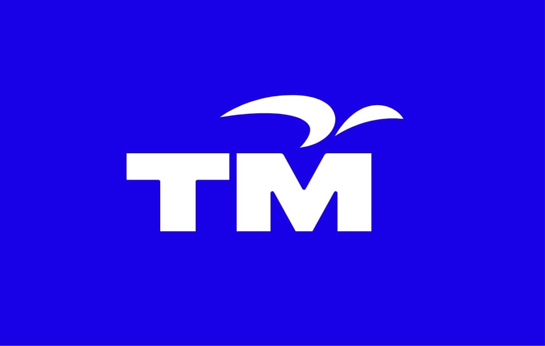
The TM brand logo is built with two primary components that visually personify the TM Brand.
Letterform
Contemporary looking letterforms are specially created for the letters T and M. The bold letters signify an organisation that is stable and trustworthy, yet dynamic and forward-thinking.
Wing mark
A representation of a bird soaring - symbolic of the confidence of a leader with pride, as we move towards a progressive Digital Malaysia.
Logo colours
The rich blue articulates a sense of stability while signaling a degree of change. The vibrant orange and red express dynamism and innovation.
COBALT BLUE
Pantone 2736CC 100 M 67 Y 0 K 0
R 24 G 0 B 231
HEX 1800E7
ACCENT ORANGE
Pantone Orange 021CC 0 M 65 Y 100 K 0
R 255 G 94 B 0
HEX FF5E00
RED
Pantone 2349CC 0M 90 Y 93 K 0
R 216 G 46 B 0
HEX D82E00
02 | 07
Clear Space & Minimum Size
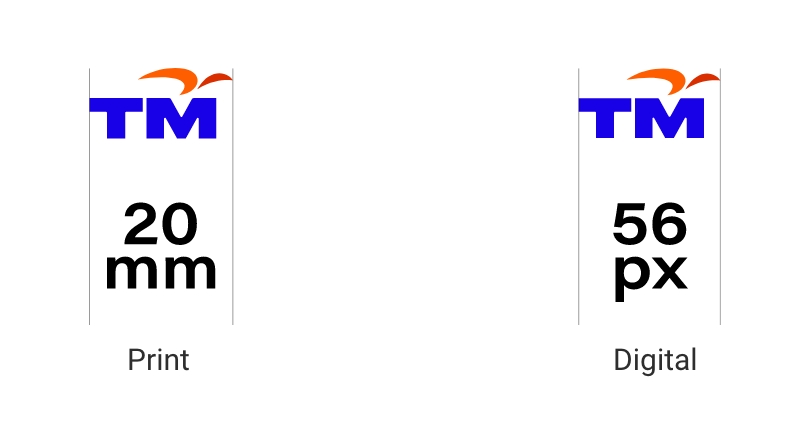
Clear SpaceThe TM brand logo requires clear space on all sides. The minimum clear space is equal to ‘X’ as shown.
Clear Space
The minimum size for print is 20mm and
56px for digital.
Use of the TM logo in full colour is preferred
X = Width of ‘T’ (Bottom).
Minimum Size
03 | 07
Colour Variations
The TM brand logo has been created in full colour and monotone variations.
These logo artworks are available in Pantone, CMYK, RGB and Hex colour formats.
Always use the full colour version whenever possible. When full colour reproduction is not possible, the grayscale version may be used.
Full Colour

Full Colour
on Light Colour Background
Single Colour

Reverse White
on Dark Colour Background
Greyscale

Monotone Logo
on Light Colour Background
04 | 07
Do’s - Best Practices
The TM brand logo is used in advertising, literature (brochures, catalogues, flyers), on product packaging, in web and mobile design, and in office applications.
Use the full colour logotype on white background wherever possible. For the reversed white version of the logo, the whole logo will be in white to ensure full visibility.
Background
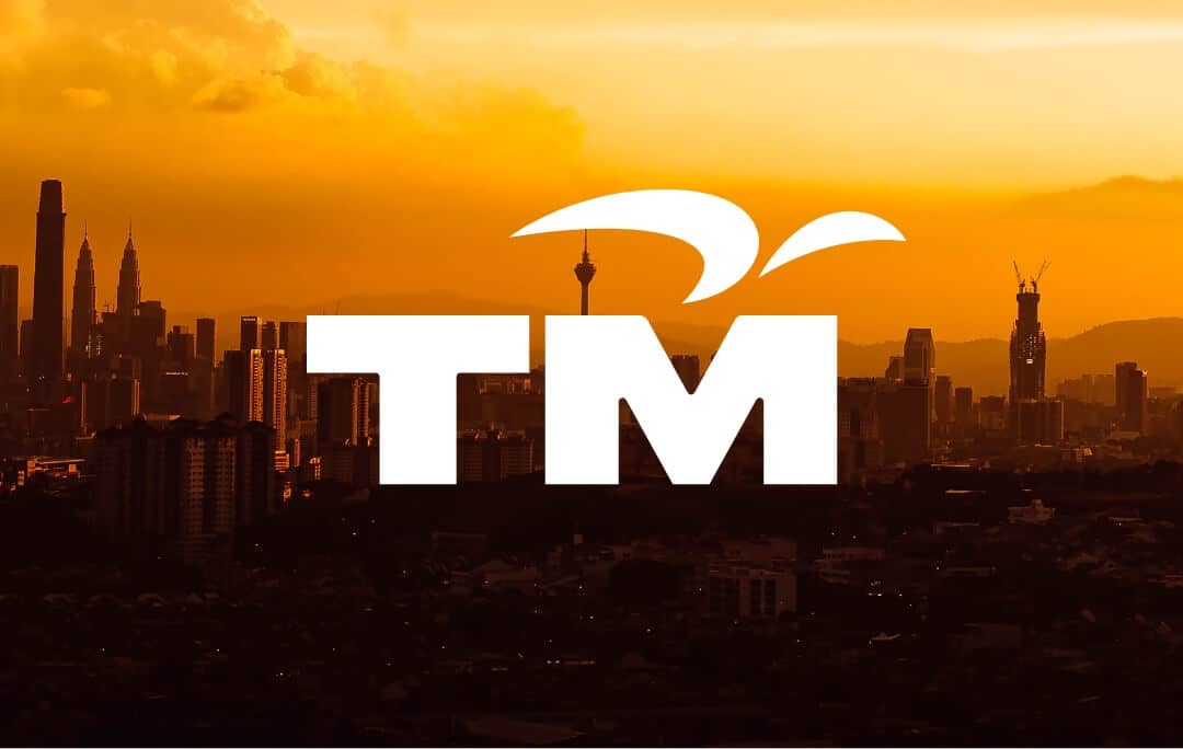
The TM logo is preferably presented on a white or single colour light background. Avoid a coloured background. Use a calm background when using the TM logo on pictures.
05 | 07
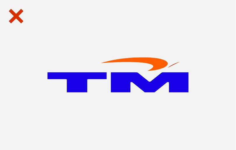
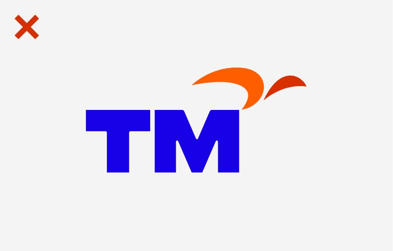
Don’ts - Misuse
Please avoid incorrect examples shown.
The colour of the TM brand logo is firmly defined and cannot be changed. Self-produced brand logos are not allowed.
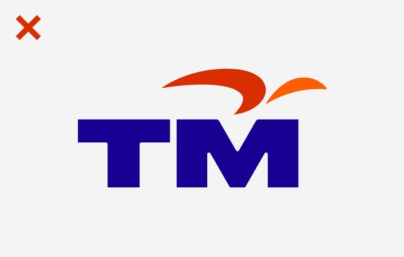
Do not change the colour of the logo.
Do not change the colour of the logo.
Do not distort the logo in any way.
Do not distort the logo in any way.
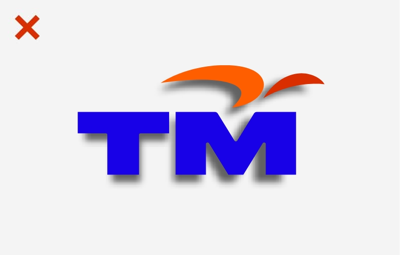
Do not add any effect to the logo.
Do not add any effect to the logo.
Do not recompose the logo.
Do not recompose the logo.
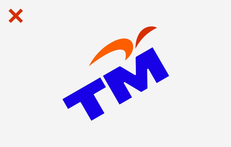
Do not tilt or rotate the logo.
Do not tilt or rotate the logo.

Do not change the typeface.
Do not change the typeface.
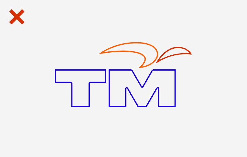
Do not outline or frame the logo.
Do not outline or frame the logo.
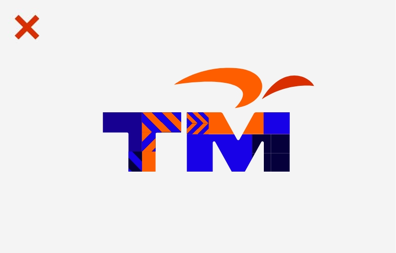
Do not fill the logo with patterns or images.
Do not fill the logo with patterns or images.
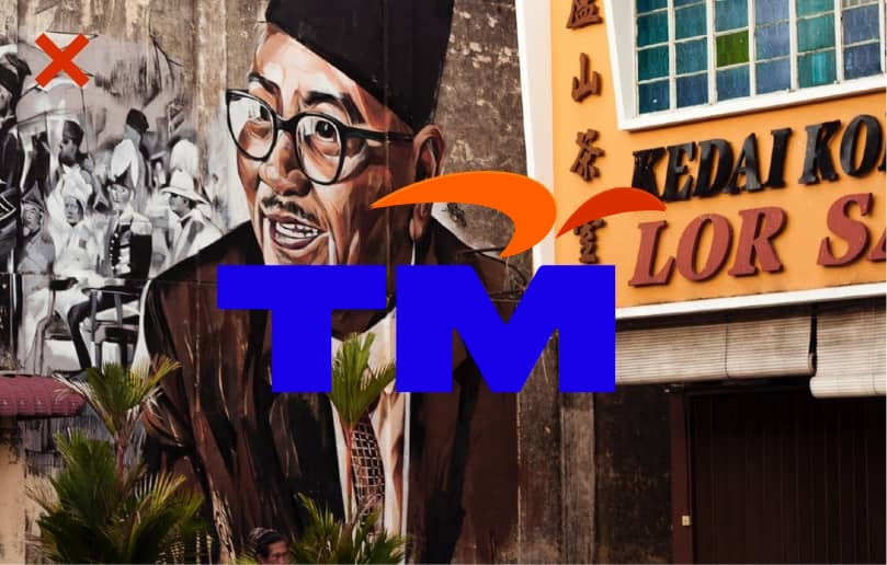
Do not place the logo on a background that may interfere with its visibility.
Do not place the logo on a background that may interfere with its visibility.
06 | 07
Logo With Brand Tagline
Primary Usage Tagline
The TM brand logo may appear with the “Your Next Is Now” tagline in stacked form, as illustrated on the right.
The brand tagline can be placed at a ‘Y’ distance from the left side of the TM logo.
Usage of the TM brand tagline is not restricted to the lockup, and can be used as a standalone in different applications.
However, the TM logo must always appear first followed by it.
Brand Tagline Font Type
– HK Grotesk Wide SemiBold
– Cobalt Blue
Dividing Line
– Cobalt Blue
X = Width of ‘T’ (Bottom)
Y = Height of ‘T’ (Top)


07 | 07
Logo With Brand Tagline
Secondary Usage Tagline
In certain instances, the TM brand logo can be locked up with the brand tagline in communication materials.
The TM logo requires clear space on all sides. The minimum clear space is equal to ‘X’ as shown.
The brand tagline can be placed below the TM logo and must span across the entire width of the logo, as shown on the right.
The brand tagline is segregated from the TM logo by a horizontal bar that spans across the width of the TM logo.
Brand Tagline Font Type
– HK Grotesk Wide SemiBold
– Cobalt Blue
Dividing Line
– Cobalt Blue
X = Width of ‘T’ (Bottom)


01 | 04
Primary Colours
The primary colours consist of different shades of blue. This allows for greater flexibility when developing communication materials.
BLUE
Pantone 2736C
C 100 M 67 Y 0 K 0
R 24 G 0 B 231
HEX 1800E7
BLUE
Pantone Blue 072C
C 100 M 78 Y 0 K 10
R 24 G 0 B 146
HEX 180092
BLUE
Pantone 2716C
C 39 M 21 Y 0 K 0
R 153 G 182 B 255
HEX 99B6FF
C 0 M 0 Y 0 K 0
R 255 G 255 B 255
HEX FFFFFF
C 0 M 0 Y 0 K 100
R 0 G 0 B 0
HEX 000000
02 | 04
Secondary Colours
The palette of secondary colours contrast refreshingly with primary brand colours. Together, they convey a sense of growth, optimism and ambition.
Pantone 2018C
C 0 M 47 Y 78 K 0
R 255 G 122 B 0
HEX FF7A00
ORANGE
Pantone 2017C
C 0 M 31 Y 46 K 0
R 247 G 185 B 134
HEX F7B986
ORANGE
Pantone Orange 021C
C 0 M 65 Y 100 K 0
R 255 G 94 B 0
HEX FF5E00
Pantone 2349C
C 0 M 90 Y 93 K 0
R 216 G 46 B 0
HEX D82E00
03 | 04
Special Edition Colours
To mark special occasions, the TM brand logo can be used exclusively in Gold and Silver, with custom printing finishings such as hot stamping, embossing, debossing, lamination, spot UV and the like to achieve the precise tones of the approved Gold and Silver.
Pantone 875C
Pantone 877C
04 | 04
Proportions
Shown here are the recommended proportions of the primary to secondary colours.
Please note that this is merely a guide to help create a uniquely TM visual expression. Should there be a need to veer slightly away from the recommendation, it can be done so as long as it keeps to the integrity of the visual identity system of the brand.

01 | 04
Typeface
The headline typeface is HK Grotesk and the body copy typeface is Roboto.
Shown on the right are the different weights that can be used when developing communications with the font type.
HK Grotesk Wide Black
ABCDEFGHIJKLM
NOPQRSTUVWXYZ
abcdefghijklm
nopqrstuvwxyz
0123456789
HK Grotesk Wide Bold
ABCDEFGHIJKLM
NOPQRSTUVWXYZ
abcdefghijklm
nopqrstuvwxyz
0123456789
Roboto Bold
ABCDEFGHIJKLM
NOPQRSTUVWXYZ
abcdefghijklm
nopqrstuvwxyz
0123456789
Roboto Light
ABCDEFGHIJKLM
NOPQRSTUVWXYZ
abcdefghijklm
nopqrstuvwxyz
0123456789
02 | 04
Primary Font:
HK Grotesk Wide
Uses:
Headline
Callouts
Styles to Use:
Bold & Black
Applications:
Digital
Print
HK Grotesk Wide Bold
ABCDEFGHIJKLMN
OPQRSTUVWXYZ
abcdefghijklmn
opqrstuvwxyz
0123456789
HK Grotesk Wide Black
ABCDEFGHIJKLMN
OPQRSTUVWXYZ
abcdefghijklmn
opqrstuvwxyz
0123456789
03 | 04
Secondary Font:
Roboto
Uses:
Subheads
Body Copy
Styles to Use:
Light & Bold
Applications:
Digital
Print
Roboto Light
ABCDEFGHIJKLMN
OPQRSTUVWXYZ
abcdefghijklmn
opqrstuvwxyz
0123456789
Roboto Bold
ABCDEFGHIJKLMN
OPQRSTUVWXYZ
abcdefghijklmn
opqrstuvwxyz
0123456789
04 | 04
Sample Setups
Headline:
HK Grotesk Wide
Sub Headline:
Roboto Bold
Body Copy:
Roboto Light
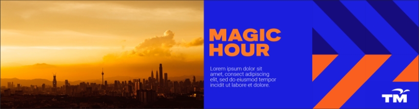
Headlines should primarily be in all caps. Similarly, sentence cases can be used for headlines to accommodate different layout specifications.
Primary Usage - All Caps
COULD YOUR NEXT BRAND GUIDELINE BE THIS EPIC?
Secondary Usage - Sentence Case
Create your next moment with TM
Lorem ipsum dolor sit amet, consectetur adipiscing elit, sed do.

Sub Headline
Lorem ipsum dolor sit amet, consectetur adipiscing elit, sed do eiusmod tempor incididunt ut labore et dolore magna aliqua. Ut enim ad minim veniam, quis nostrud exercitation ullamco laboris nisi ut aliquip exea commodo consequat.
Body Copy
01 | 05
Introduction
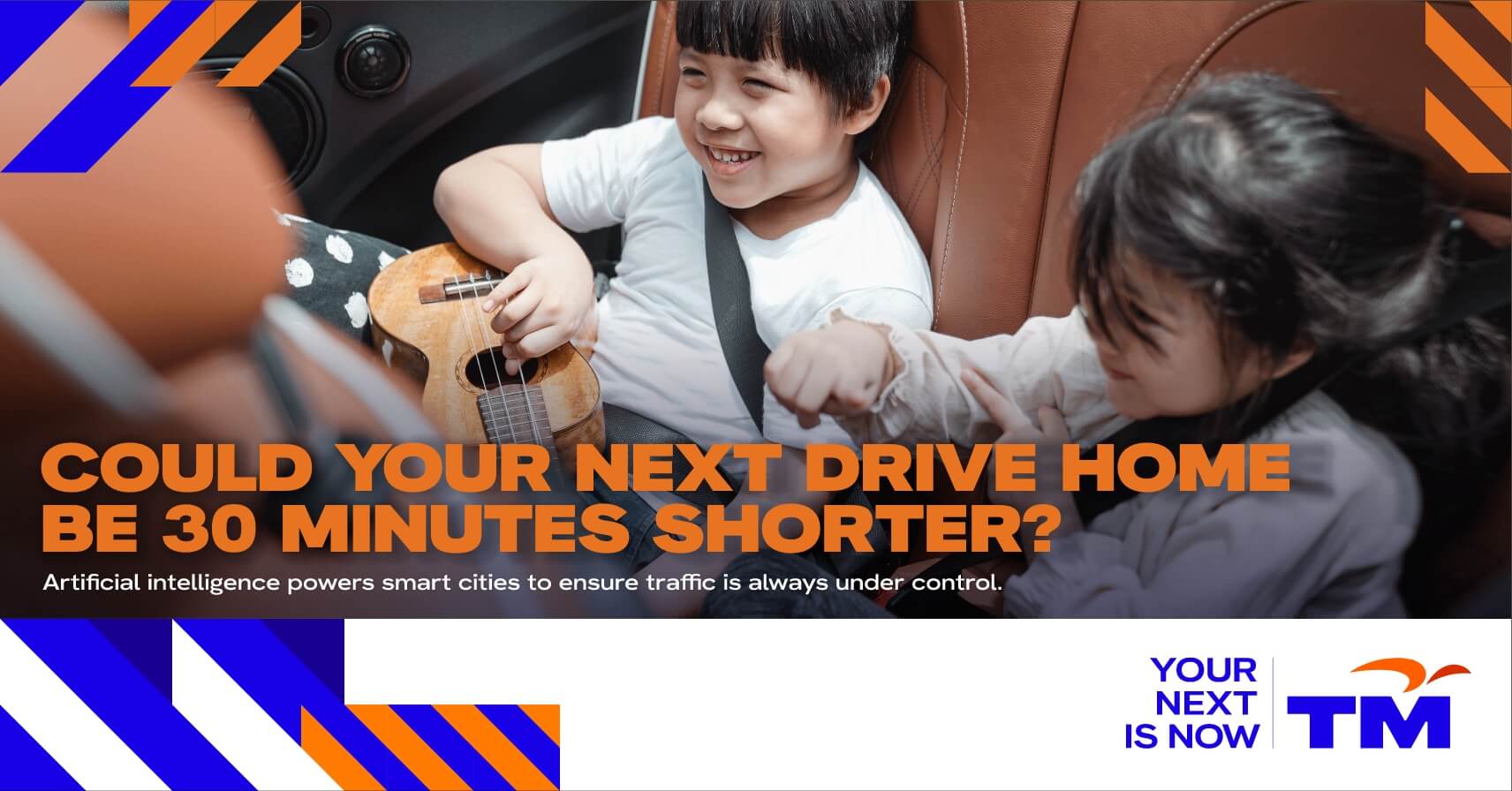
The photography aims to depict real life moments that are authentic, emotive and relevant.
02 | 05
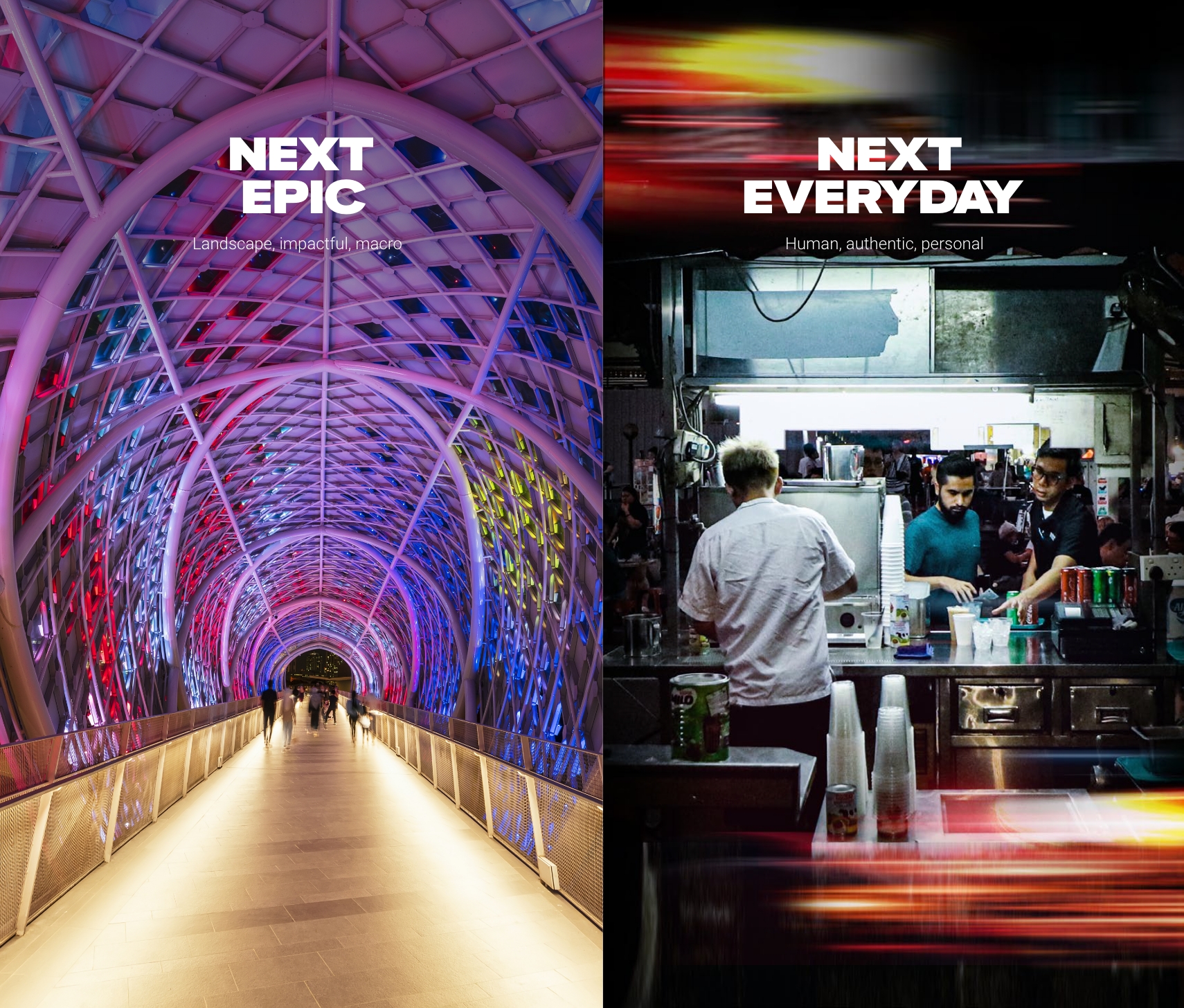
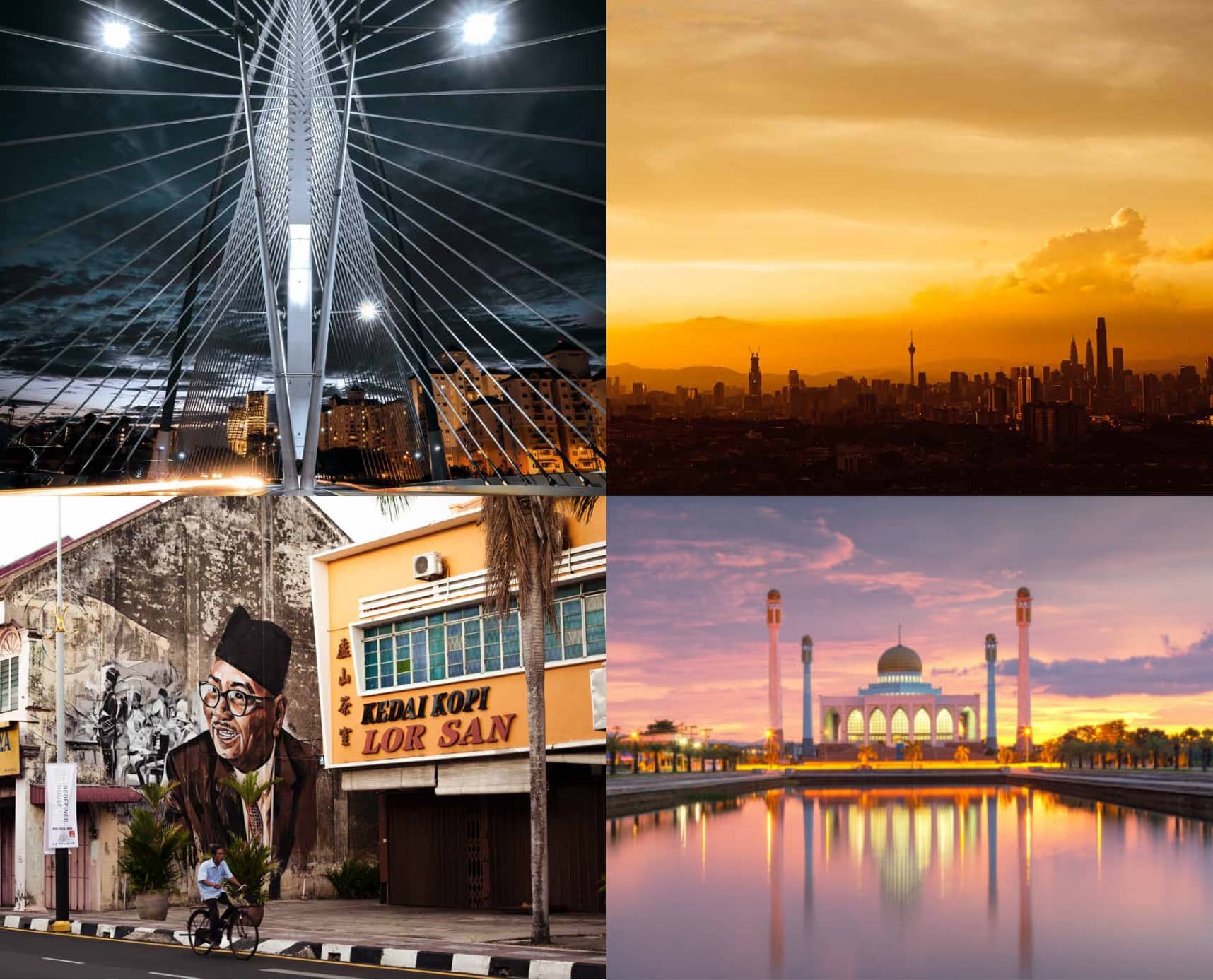
Next Epic
Landscape Photography
Focus on epic moments through landscape photographs with depth and bigness, exuding a sense of energy that is not staged.
- Connectivity
- Digital lifestyle
- Smart nation
- Innovation
- Everyday
- Personal
- Authentic
- Hopeful
- Positive
- Staged
- Cold
- Posed
- Negative
- Too serious
03 | 05
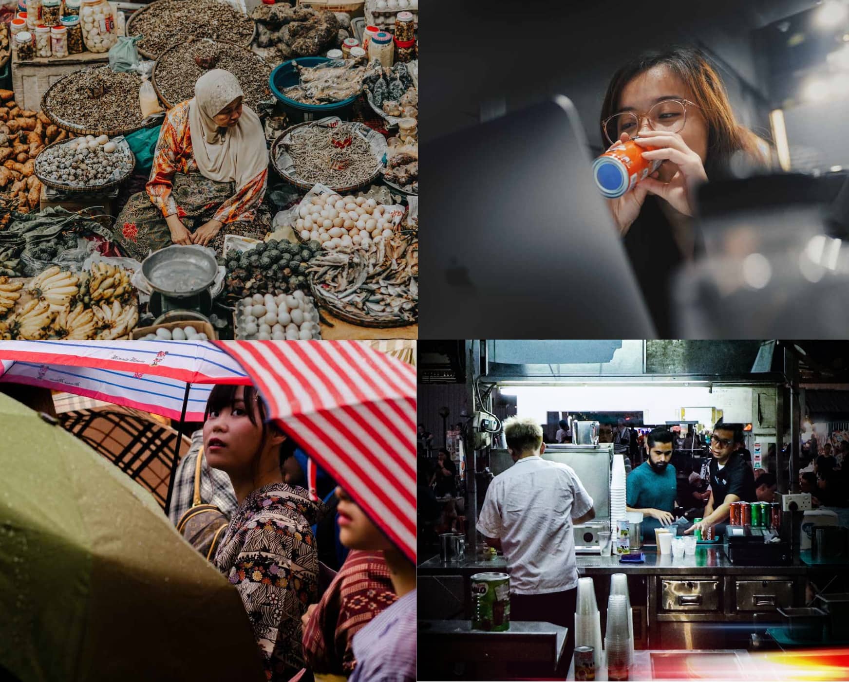
Next Everyday
People Photography
Focus on close-up expressions of individuals being empowered by their everyday lives, exuding a sense of purposefulness and energy that is not staged.
- Connectivity
- Digital lifestyle
- Smart nation
- Innovation
- Contextual
- Authentic
- Inclusive
- Energetic
- Hopeful
- Positive
- Cold
- Exclusive
- Static
- Negative
- Too serious
04 | 05
Don’ts
Shown on the right are incorrect examples of the photography.
Staged
Staged
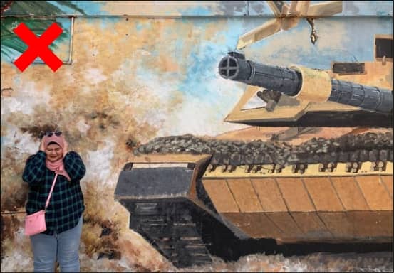
Negative
Negative
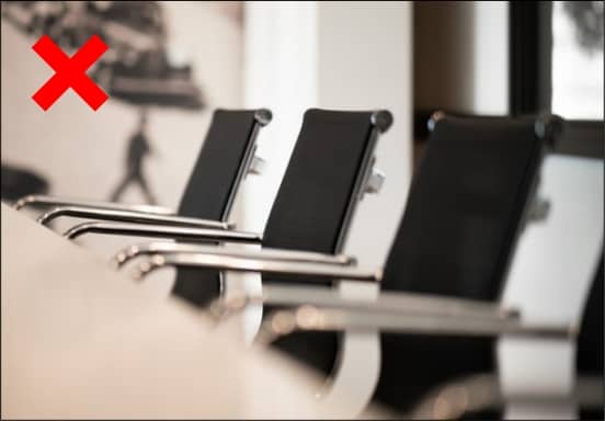
Cold
Cold
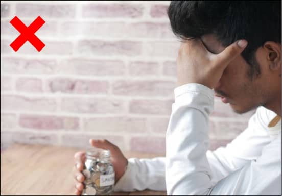
Negative
Negative
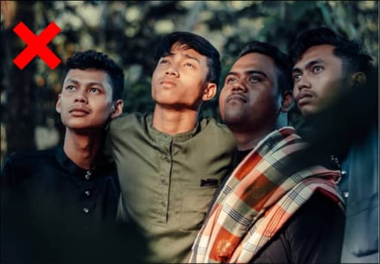
Too Serious
Too Serious
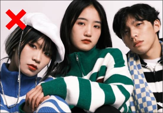
Posed
Posed
05 | 05
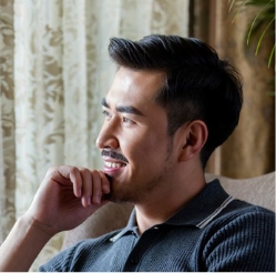
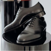
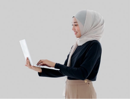
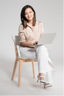
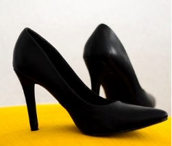
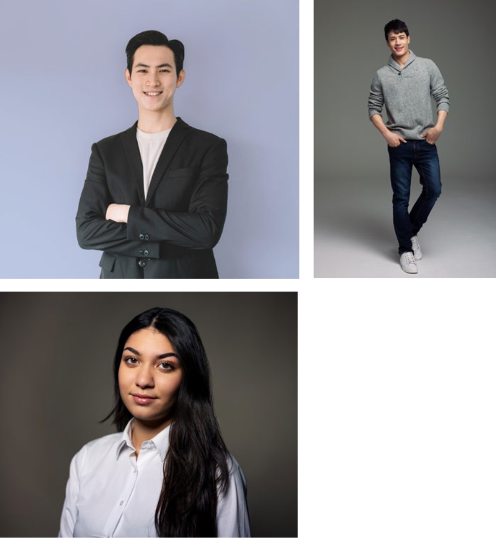
Photography Styling
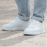
Male
Semi Formal Attire References
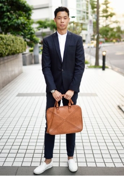
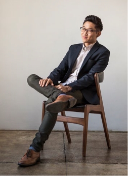

Pose References
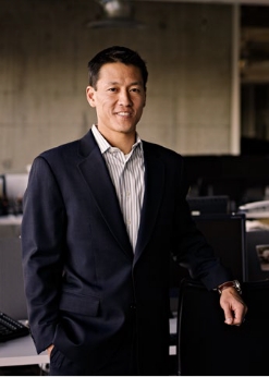
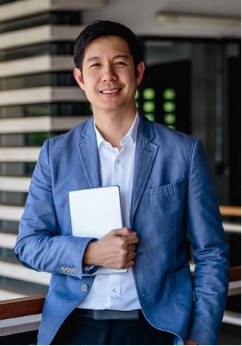

Smart Casual Attire References


Pose References


Hairstyles References

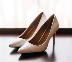
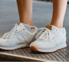
Semi Formal Shoes References
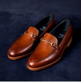
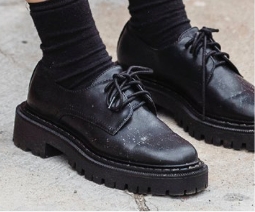
Smart Casual Shoes References
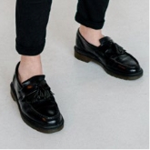
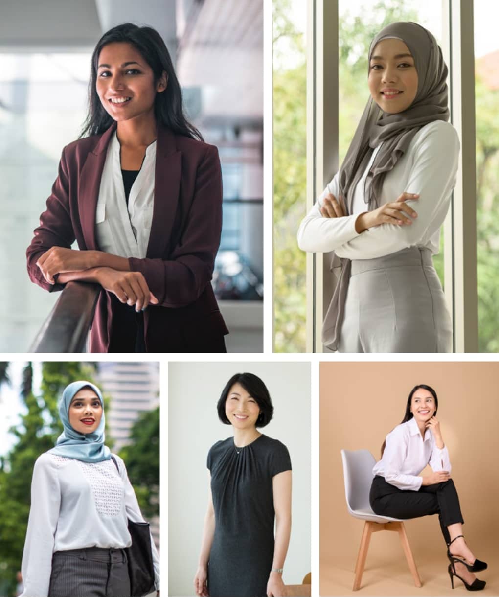
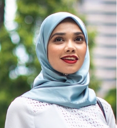
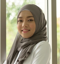
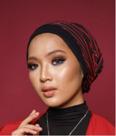
Female
Semi Formal Attire References
Pose References
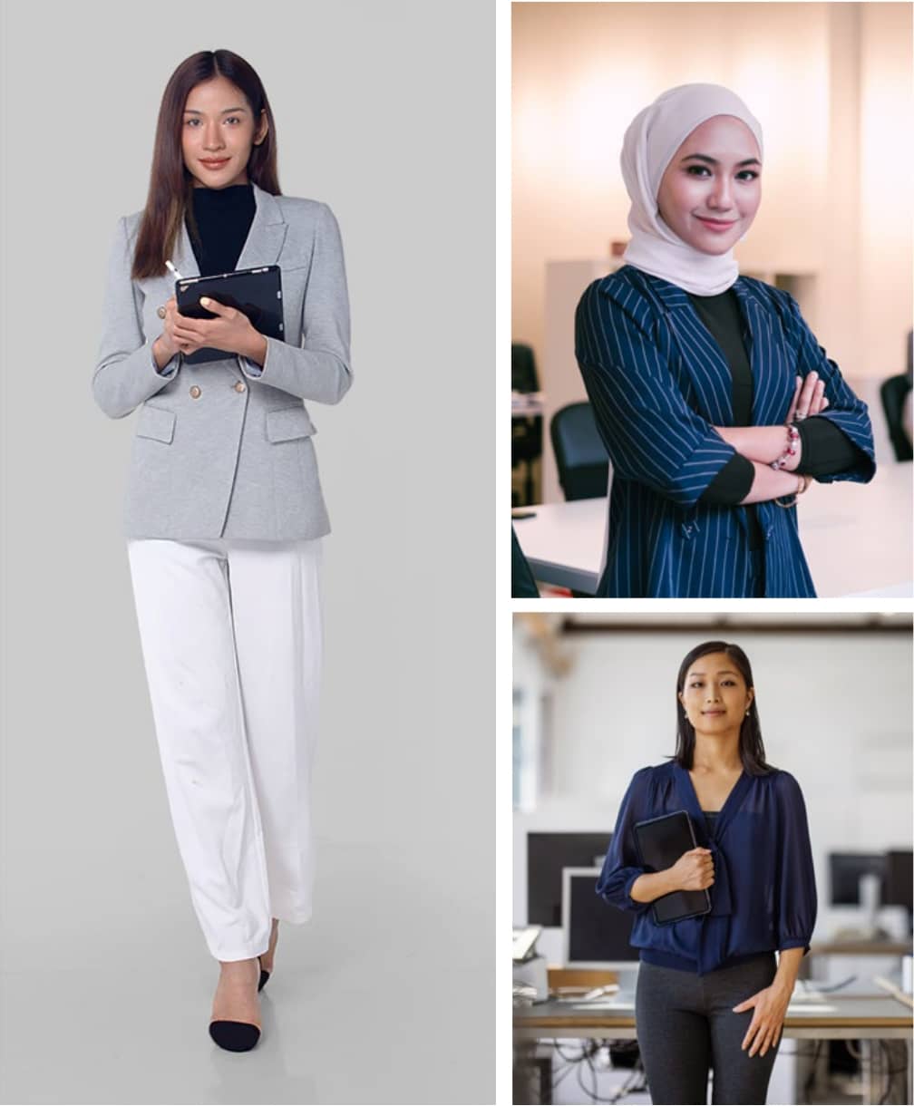
Smart Casual Attire References
Pose References
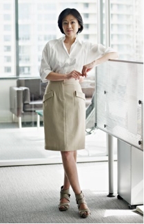
Semi Formal Shoes References
Smart Casual Shoes References
Free Hair and Scarf References


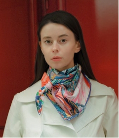
Hijab References
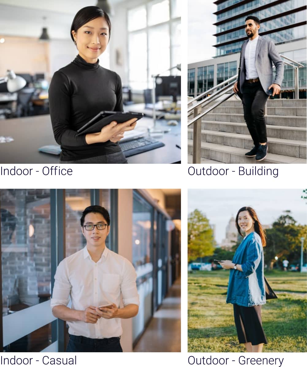
Background
Studio Background References
Non-Studio Background References
01 | 03
Overview
The illustration plays a big role in communicating abstract ideas and emotive everyday moments.
There are three approaches for illustrations:
- Big Concepts
- Daily Moments
- Quick Understanding
Big Concepts

 Stylistic principles
- Editorial
- Smart
- Depth and perspective
Daily Moments

 Stylistic principles
- Geometric
- Friendly and approachable
- Human
Quick Understanding

 Stylistic principles
- Infographic
- Geometric
- Friendly and approachable
02 | 03
Usage
Shown on the right are ways the illustrations can be used in communication materials.


03 | 03
Do’s & Don’ts
Shown here are examples of do’s and don’ts pertaining to the illustration style.
- Simple
- Clean
- Emotive Scenarios
- Focused
- Clutter
- Stock Vector
- Generic
- Abstract
Do’s
Don’ts


01 | 03
Introduction
The icons are built from basic shapes. They are functional elements that can be used digitally and in print.
BLUE
Pantone 2736C
C 89 M 81 Y 0 K 0
R 24 G 0 B 231
HEX 1800E7
C 0 M 0 Y 0 K 0
R 255 G 255 B 255
HEX FFFFFF
02 | 03
Filled Icons
Filled icons should be within headers and titles to drive sharp communication messages about topics being presented.


Service


Coverage


Payment


Service
03 | 03
Outlined Icons
Outlined icons can be used as visual cues for key talking points within topics being presented.
Both filled and outlined icons should never be used together to minimise clutter and to maintain design consistency.


Service


Coverage


Payment


Service
01 | 05
Introduction
The patterns play a role in the TM visual identity system. The movement and progression of the bold chevrons exemplify the “Your Next is Now” tagline.
These patterns have flexibility and can be easily adapted for different formats of communication.

02 | 05
Colour Combinations
To create consistency, a minimum of two (2) and a maximum of three (3) colours are allowed per unit of the pattern. The use of blue is also an important element for the TM pattern unit.


03 | 05
Tutorial
Shown below is a quick guide on creating unique patterns for any communication.
Step 1
Create
Grid

Create a grid with even square units within. For this example, the dimensions are 1920px by 1080px (full HD).
Step 2
Add Background Colour

Add colour blocks on the grid to ensure that the patterns keep to colour proportions of the TM brand.
Step 3
Add Pattern

Add patterns into the grid. Please ensure that the patterns fit to the grid to create a seamless semi tessellation.
Step 4
Remove Grid

Remove the grid. Now you have a base to add on typography and imagery onto.
04 | 05
Examples
Here are some ways the patterns can be used to create the iconic and ownable TM visual expression.
05 | 05
Don’ts
Here are some examples of what should not be done with the patterns. Please avoid improper use of the patterns as shown.

Do not change the colours of the patterns other than those specified.
Do not change the colours of the patterns other than those specified.

Do not distort the patterns.
Do not distort the patterns.

Do not rotate the patterns.
Do not rotate the patterns.

Do not not add any effect to the patterns.
Do not not add any effect to the patterns.

Do not create complex patterns.
Do not create complex patterns.

Do not fill the patterns with graphics or images.
Do not fill the patterns with graphics or images.
01 | 03
Logo Proportions
Print common sizes
For all ‘A’ series documents, use the measurements below:
A0: 841x 1189 mm = 140mm
A1: 594 x 841 mm = 100mm
A2: 420 x 594 mm = 70mm
A3: 297 x 420 mm = 50mm
A4: 210 x 297 mm = 28mm
A5: 148 x 210 mm = 24mm
A6: 105 x 148 mm = 20mm
The tagline lockup should always be placed in proportion to the scale of the logo.
02 | 03
Layouts
Type A: Simple Grid Layout
- The TM brand logo placement must always be against a clear background.
- Graphic patterns can be varied within the specified area.
- Image area can be extended downwards based on the available text area.
- Headline and text area can be moved up or down within the specified area as shown.
Type B: Dynamic Grid Layout
- The TM brand logo placement must always be against a clear background.
- Main graphic pattern can vary and move around.
- Image area can be moved sideways and align to either the left or right of the main graphic pattern.
- Headline and text can be placed within main pattern and image.
- Background graphic pattern can vary and move around.
03 | 03
Horizontal Examples
Logo without tagline
Logo with tagline
01 | 02
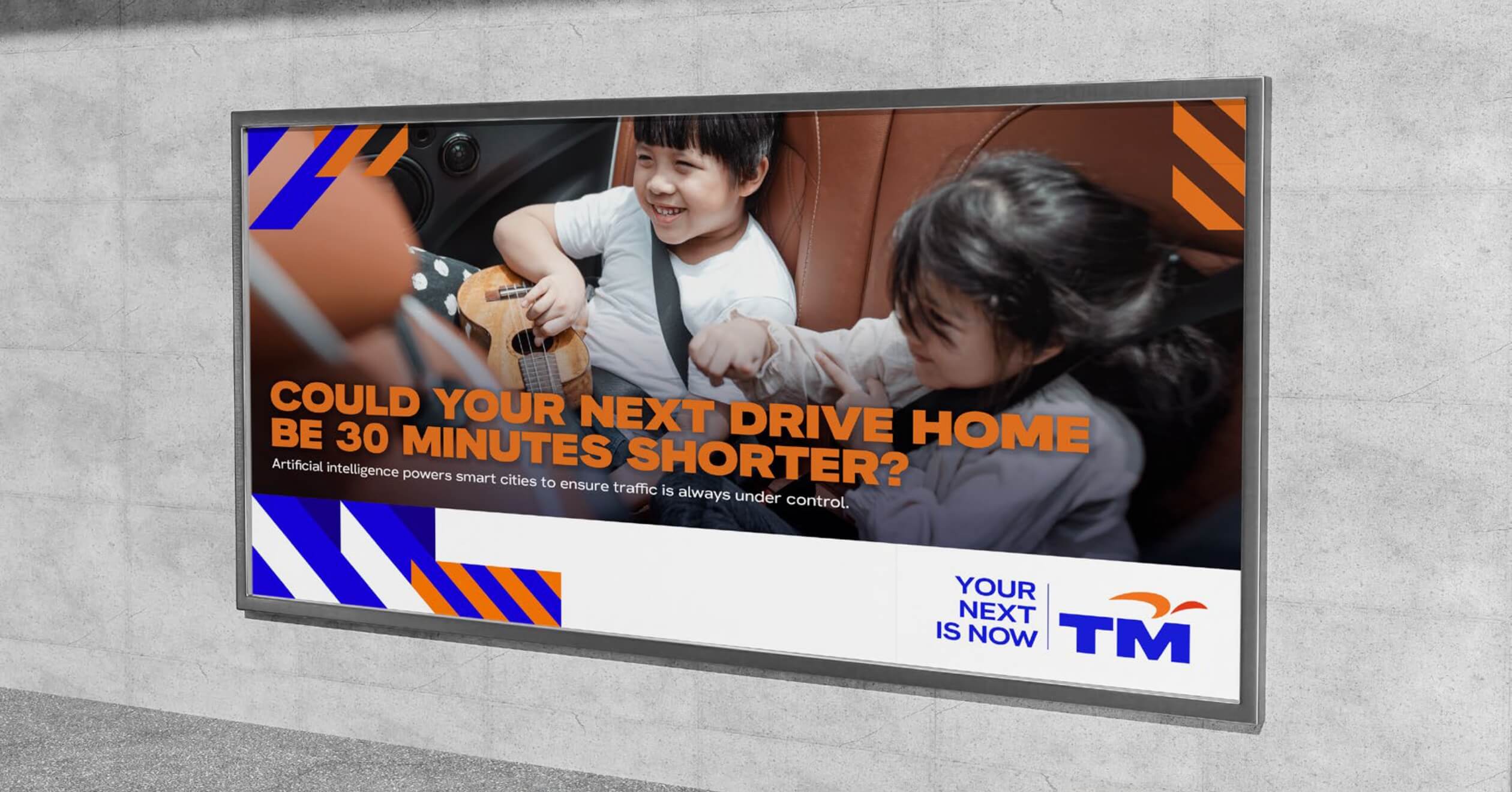
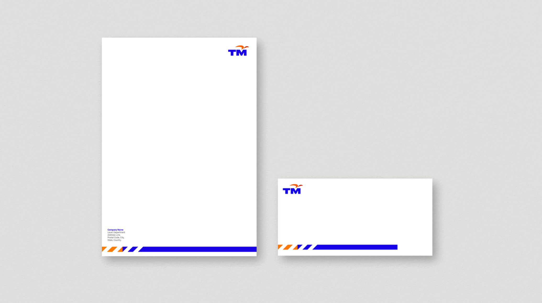
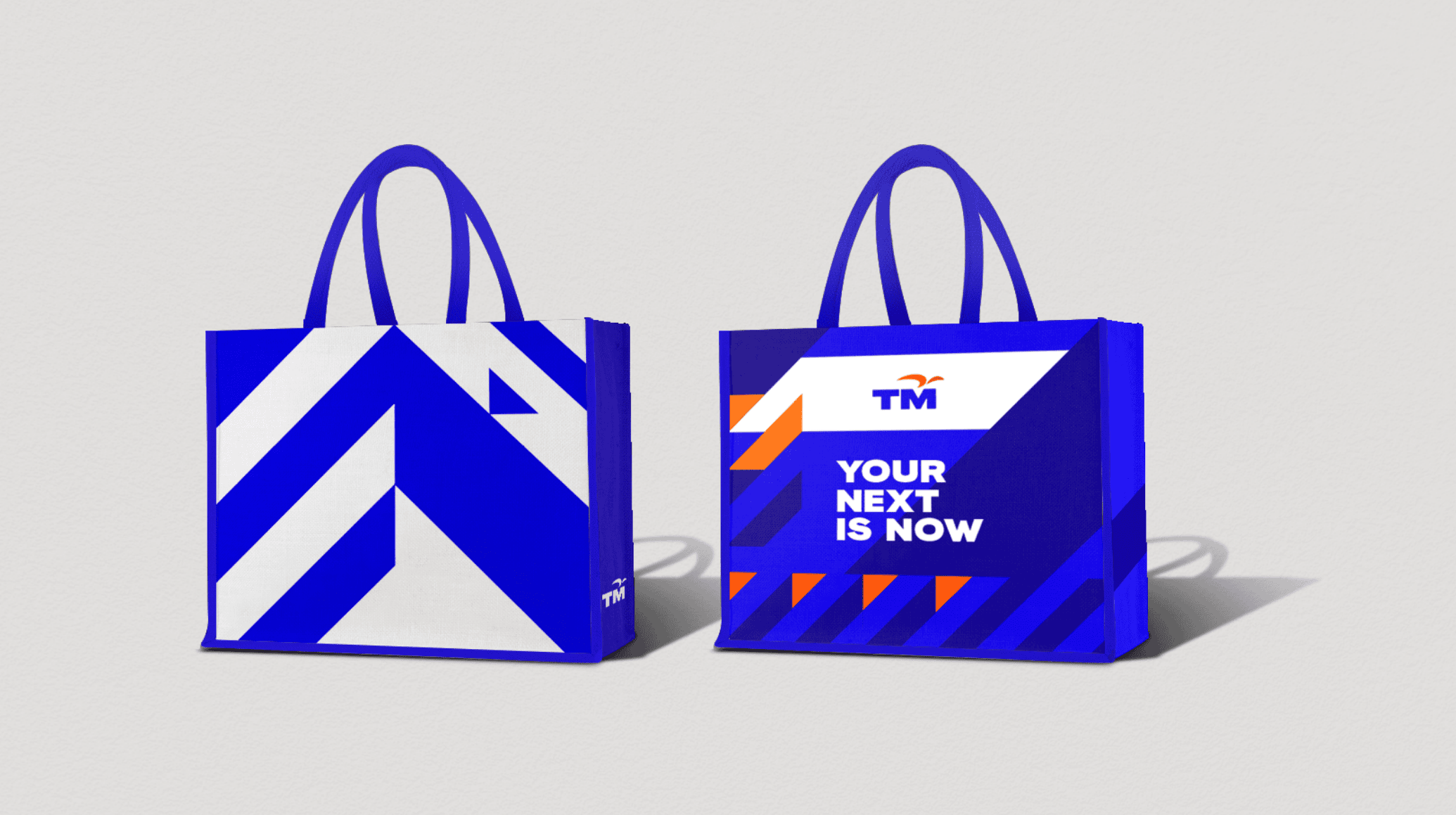
Applications - Print
Here are the look and feel examples of our printed applications.
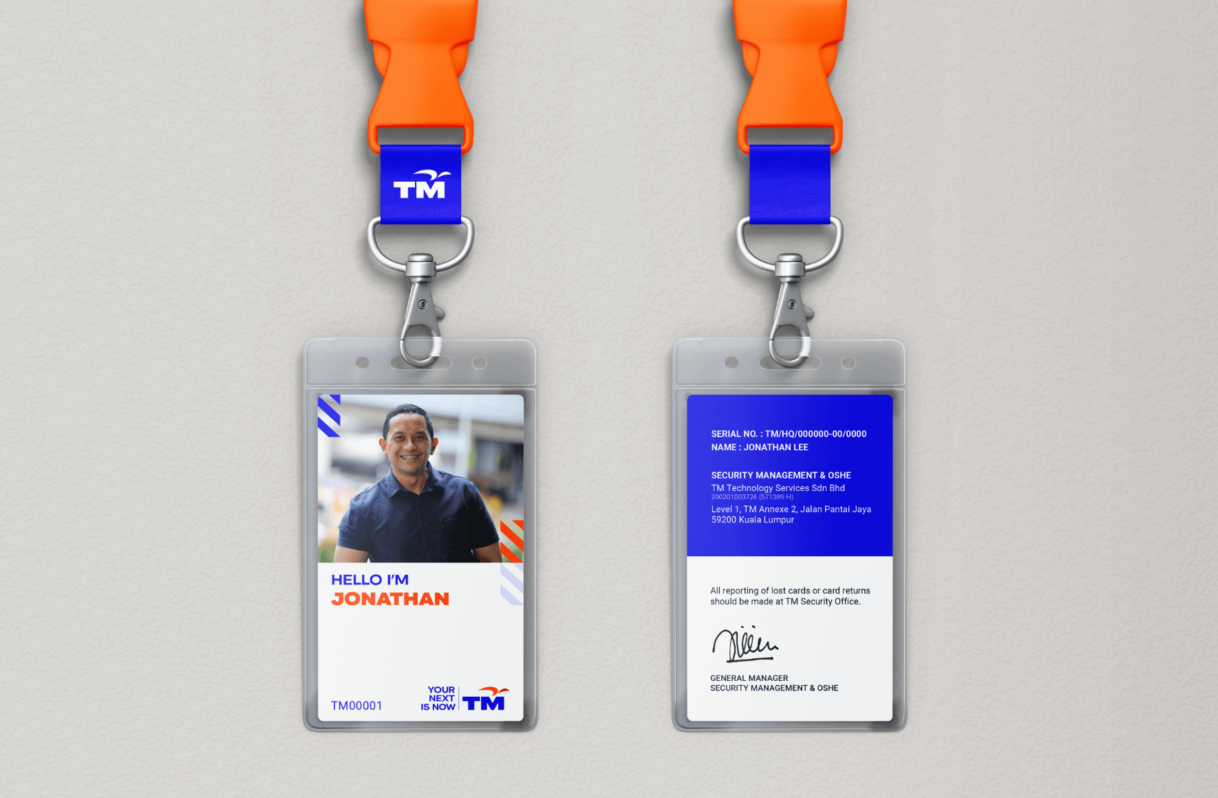
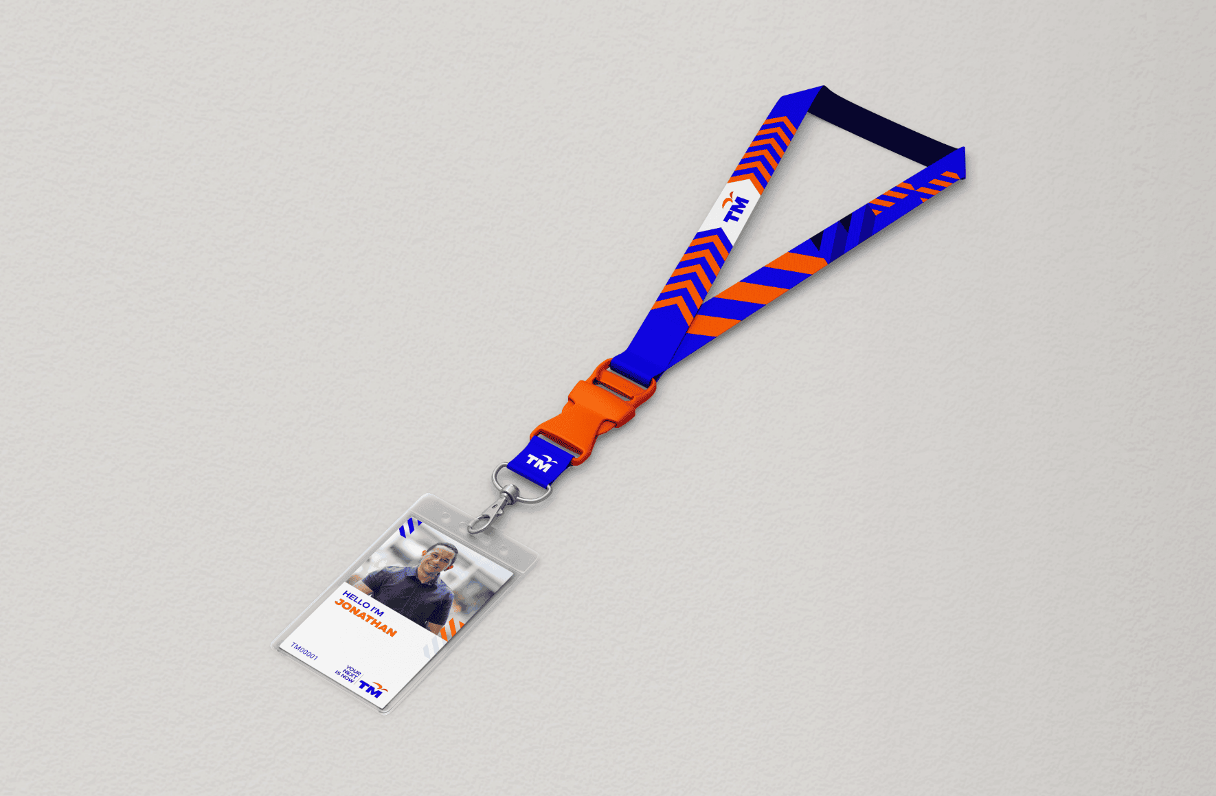
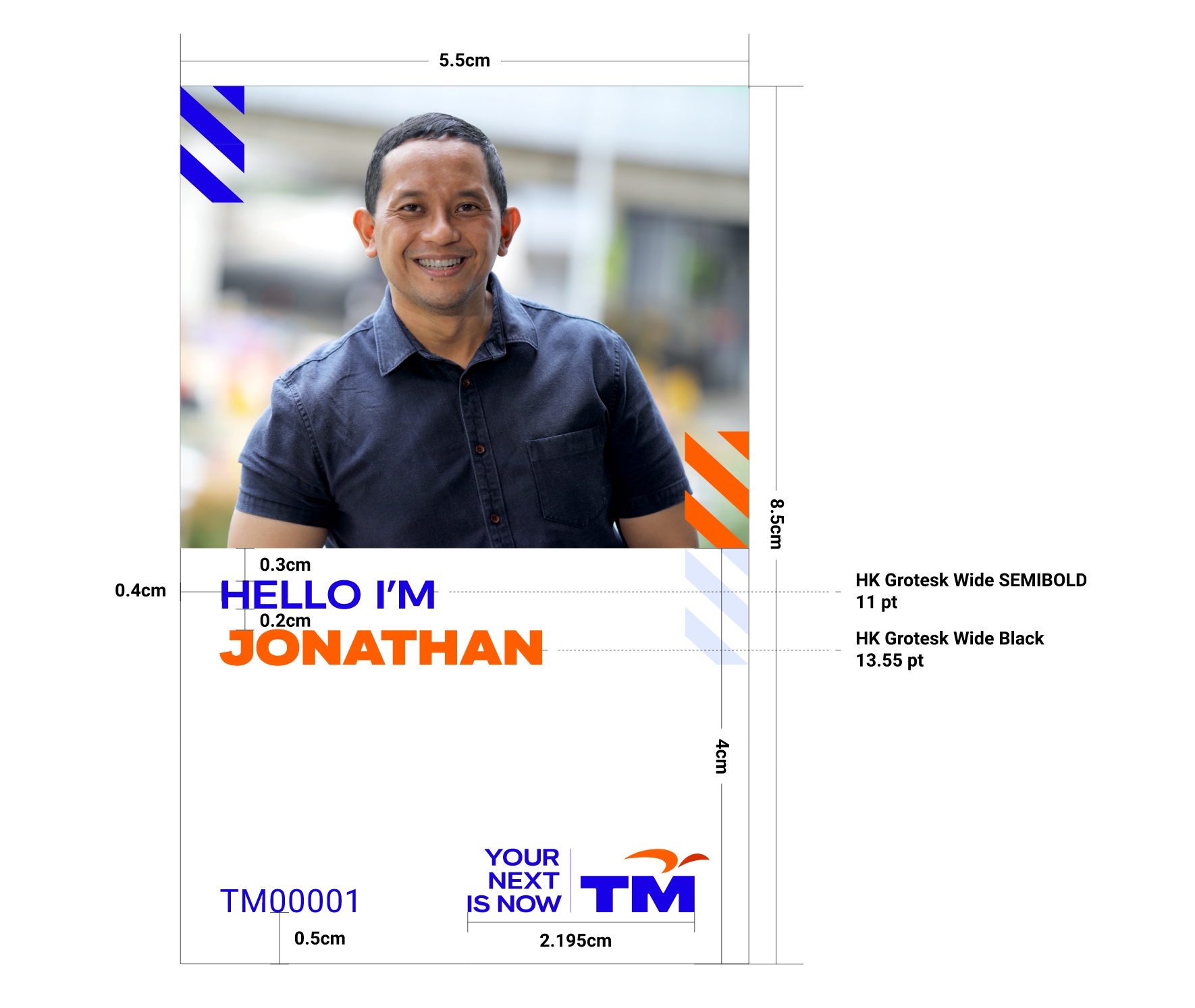
Passcard
Lanyard
Pass Card - Guide
How we present ourselves should always be in a manner that best reflects our new identity as a human-centred technology company.
Photographs used for pass cards should be clear and exude warmth, whilst maintaining a sense of professionalism.
For suitable backgrounds, please refer to the photography styling guide .

Foldable Bag
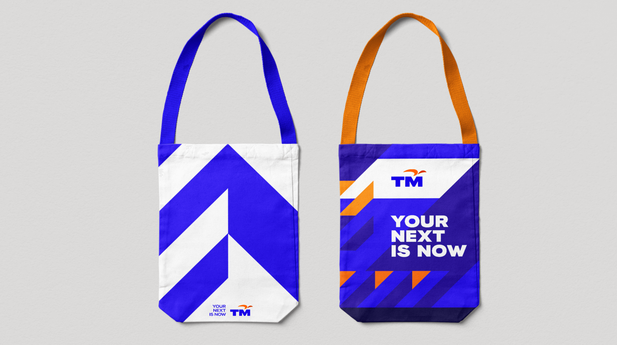
Tote Bag


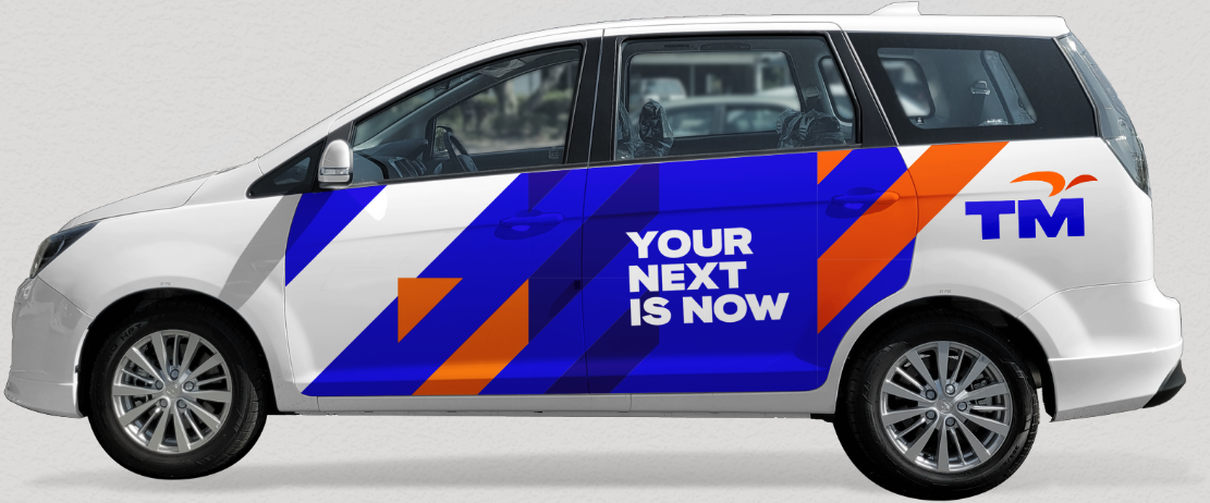
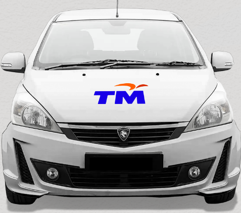
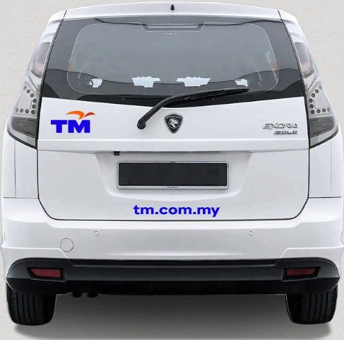
Car Livery

02 | 02
Applications - Digital
Apply these visual identity for digital applications.
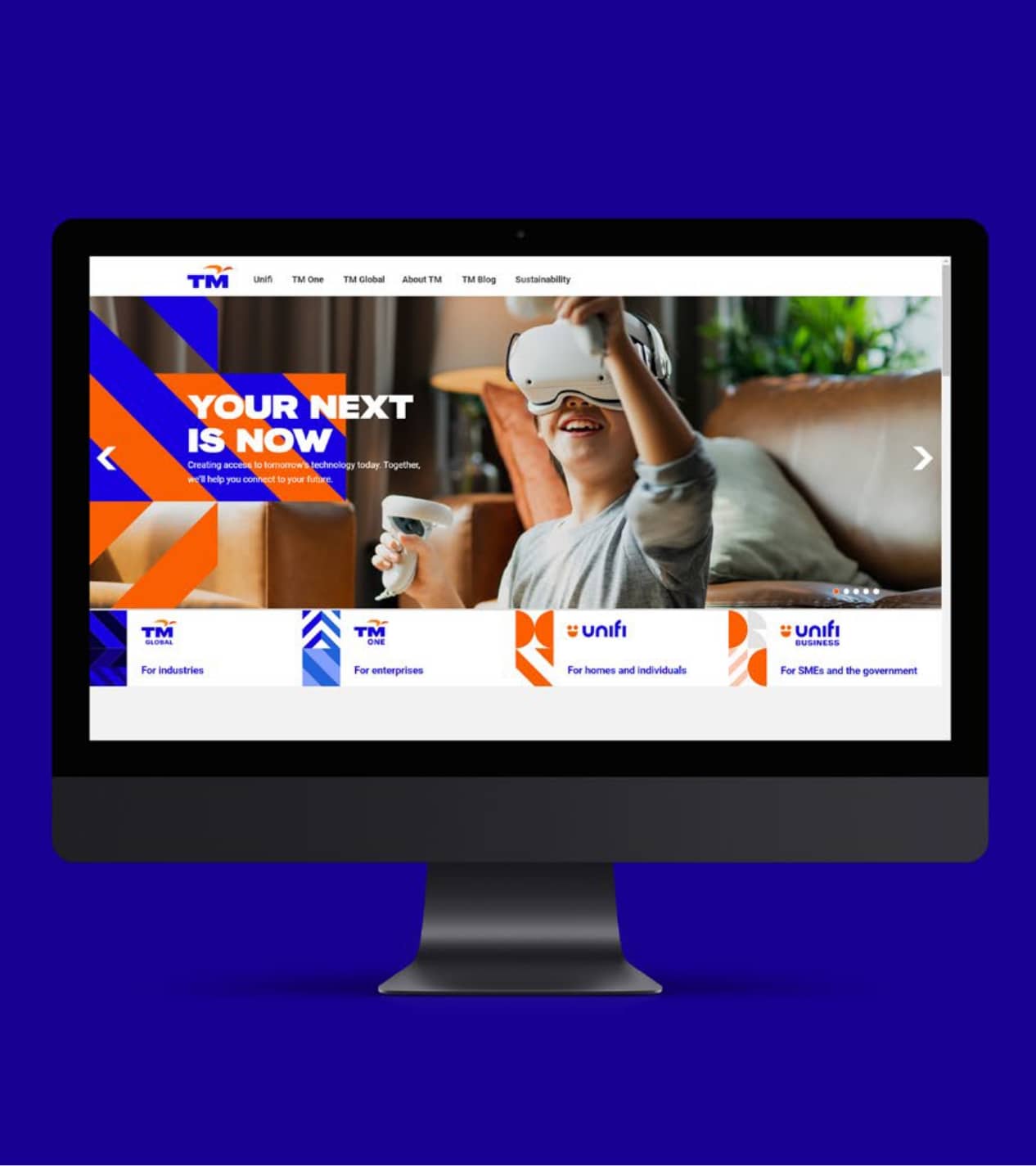
Website Landing Page
LinkedIn Page

Buttons
The font used for all buttons is HK Grotesk Wide Bold.
Desktop button size

Mobile button size

Card carousel

Radio Button


Checkbox


Icons
Icons colours
On light background
On dark background
Unfilled Forms

Filled Forms

Dropdown
Default

Dropdown
Maximum 6 selections

Maximum 6 selections

Selected

Fonts
Aa
HK Grotesk Wide Black
Headline 60/50/40
Headline 36
Headline STANDARD 26
Headline SMALL 22
Aa
Roboto Regular
Body Copy Large 18
Body Copy Standard 16
Body Copy Small 14
Body Copy Extra Small 12
Aa
HK Grotesk Wide Bold
BUTTON Copy STANDARD 16
BUTTON Copy SMALL 14
Aa
Roboto Bold
Headline Standard 20
Headline Small 18
Tabs Navigation

Tabs/Filters
Filter Tag Size

Default

Hover

Selected

Tagging on white background
Tags with icon on the left
Tags with icon on the right
Tagging
Size

Spacing

Font
Default
Highlights/Promo
Font

Title line 1
Title line 2
Body copy line 1
Body copy line 2
Body copy line 3
Title line 1
Title line 2
Body copy line 1
Body copy line 2
Body copy line 3
Table style (Desktop)
Information Table

Table title
Font: Roboto Bold 16pt
Font Colour: #FFFFFF - 70% opacity
Box Colour: #150080
Row header
Font: Roboto Bold 20pt
Font Colour: #FFFFFF
Box Colour: #1800E1
Main Row header
Font: Roboto Bold 20pt
Box Colour: #FB5E00
Line colour: #FFFFFF
Line weight: 1pt
Table Variety

Font: Roboto Bold 16pt
Font Colour: #FFFFFF
Box Colour: #1800E1 - 5% opacity
Font: Roboto Bold 20pt
Font Colour: #FFFFFF
Box Colour: #1800E1 - 15% opacity
Accordion (Desktop)
Default

Spacing

Picture Ratio

Desktop (Pop-Up)

Powerpoint Template
Cover
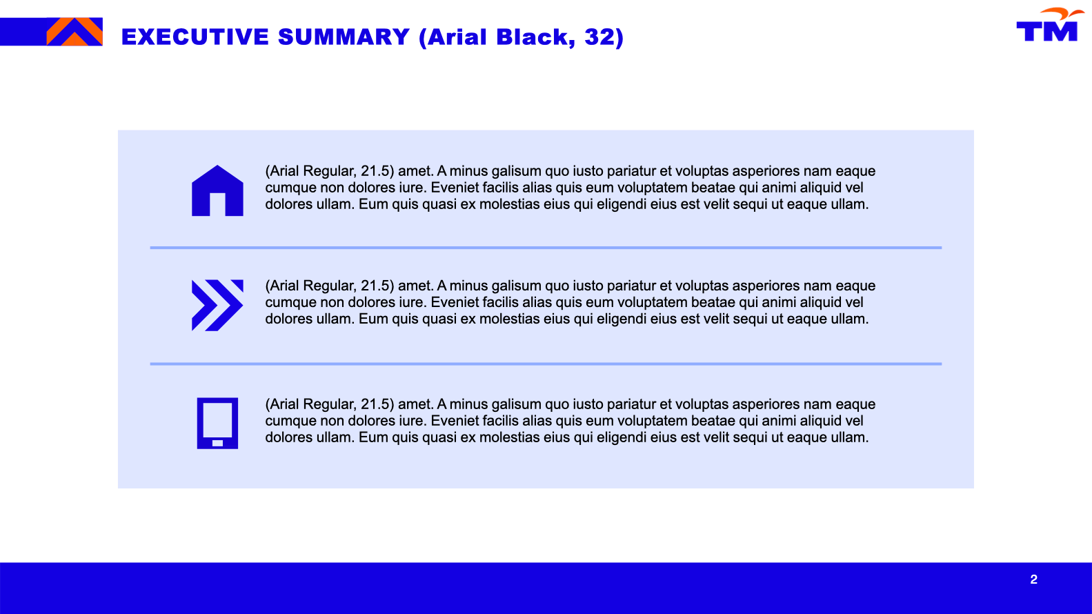
Content - Executive Summary
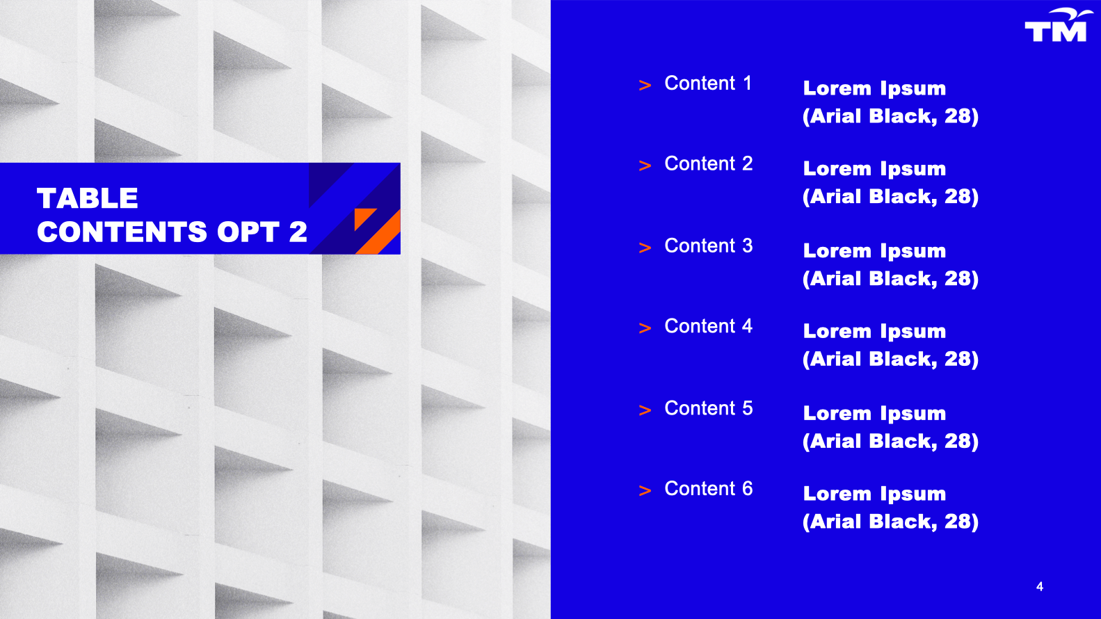
Agenda - Version 1
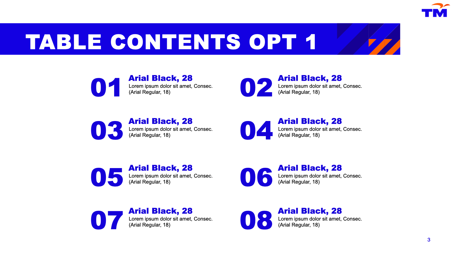
Agenda - Version 2
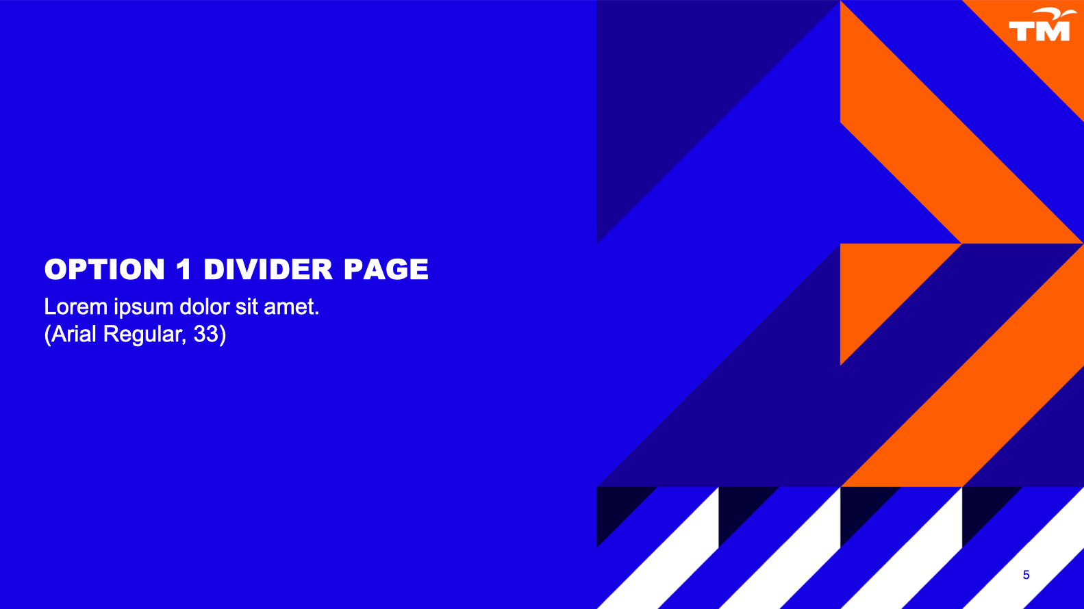
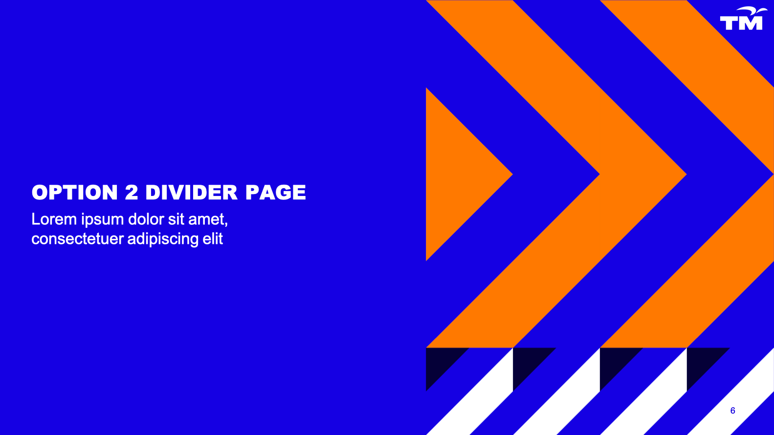
Separator - Version 1
Separator - Version 2
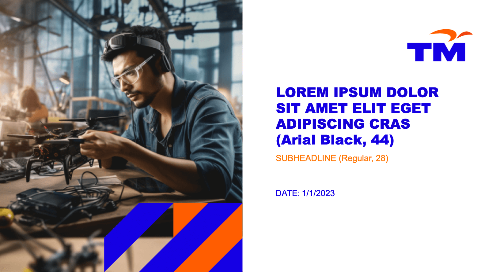
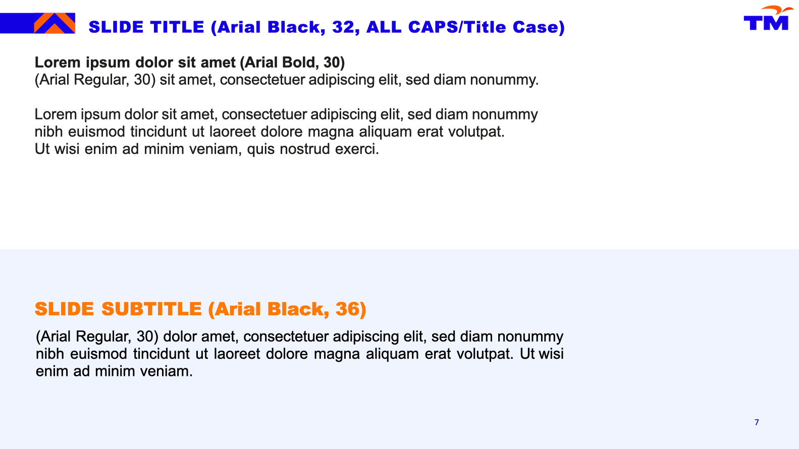
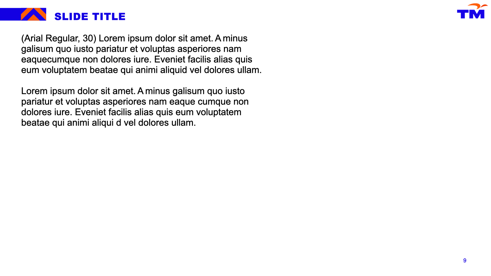
Full Text Slide - Version 1
Full Text Slide - Version 2
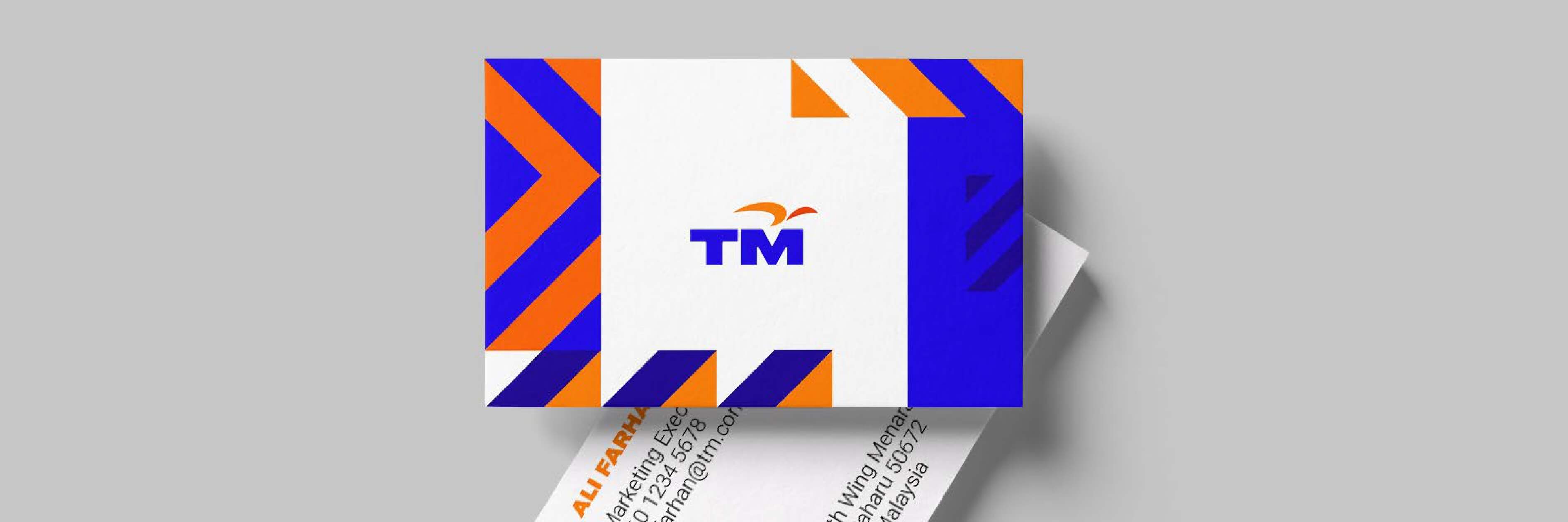
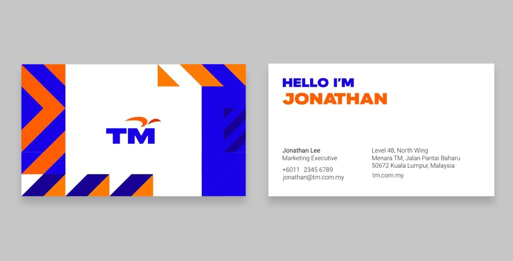
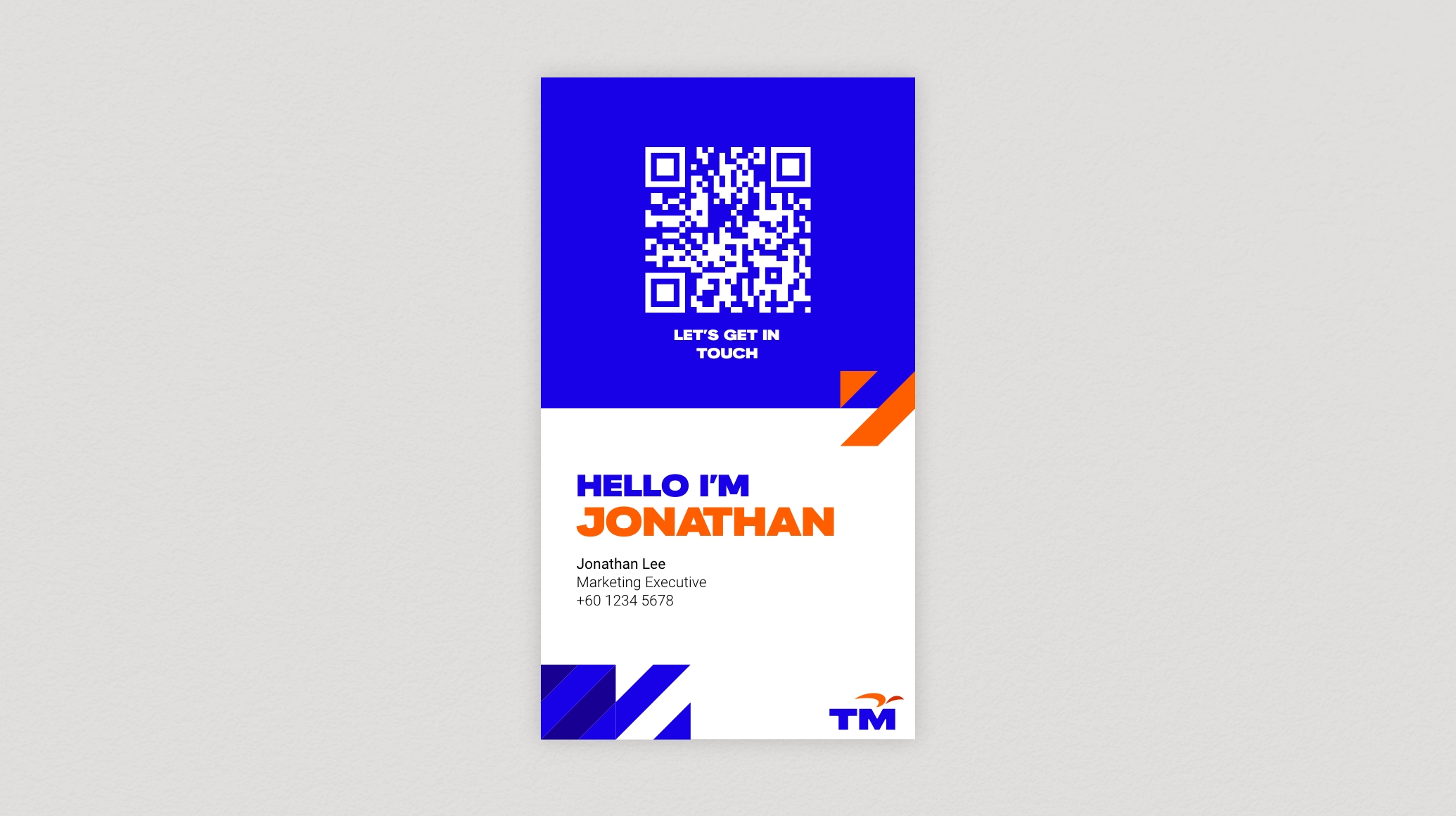
Digital Name Card
Part of our efforts to implement sustainable practices include creating digital name cards that will help reduce waste across the board, at all levels of our company. These digital name cards will help us all in doing our part to take better care of our planet.
 View steps
MS Teams
Official Meeting
 download assets Download
Watermark
 download assets Download
Illustration
 download assets Download